
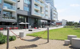
 Great landscape design focuses on user experience
In a past life, I spent my summers doing landscape maintenance and construction. While much of the work was fairly routine—pushing lawnmowers and trimming hedges—I developed a keen eye for working with greenspaces in my community.
Now that I work for a company that specializes in outdoor site furnishings, my attention has grown to include hardscape layouts as well—particularly related to traffic and vehicle control. I look at how ground materials and grading can affect installations and how effective site planning can affect usability.
In this post, we'll take a step back to look at the broader principles of landscape design—as well as some key strategies in developing great designs suitable for any urban or greenspace environment.
1. Effective landscape design improves user experience
Repetition of color and texture helps create harmony
Planning and organization make a property easier to read and navigate for visitors—helping increase comfort and familiarity.
When planning any landscape, whether it's new or existing, what's most important is to understand how it will be used. Once you know how you want people to see and use a space, every design decision should stem from this idea. Will it be an active space or one made for leisure? Is a space meant to attract visitors or direct them to an intended focal point? Working closely with owners and lead consultants will be the best way to build this understanding.
Planning should take into account the full space available, including both hardscapes (paved areas, patios, fences, posts and other non-organic structures) and softscapes (gardens, trees, lawns and other plant materials).
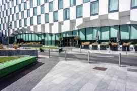 It's also important to take into account existing site conditions in the final design of a project. Things like slopes, drainage, utility infrastructure and existing structures—as well as climate and other environmental considerations—can have a significant impact on planning and design. Physical characteristics affect the construction and performance of hardscapes, while climate and drainage may also limit the type of plants that can be used.
2. Create unity through consistency and repetition
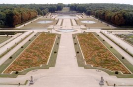
Formal lines demonstrate symmetry at the Château de Vaux-le-Vicomte, France
Once we know how we want users to interact with a landscape, we need to develop a conceptual focus.
To learn more about how professional site designers plan their projects, I consulted local Commercial and Residential Designer, Sarah d'Artois of Greenspace Design & Décor. Greenspace specializes in artificial landscape installations for both interiors and exteriors. They do both residential and commercial projects, and their work can be seen at the Vancouver Airport, the Vancouver Aquarium and the Shangri-La Hotel Vancouver.
When it comes to planning a new project, "Unity and cohesion are key principles of design, which are always a major consideration in the initial process of a project, " says d'Artois. "Without harmony, a space will lack completeness, which users sense intuitively whether they know it or not. We select certain elements to focus on, such as line, texture and shape, and combine those with selected principles—repetition, for example. Repeating a certain texture or shape throughout the landscape will help create unity."
 Without harmony, a space lacks completeness, which users sense intuitively
When looking at the designed spaces around us, we see that dominant characteristics—or attention-grabbing focal points—are key to establishing strong patterns. Unique tree species or decorative architectural features are examples of dominant features, which are ideal for building entrances, pathways, leisure spaces or other places of interest.
Strong patterns also rely on interconnection. Elements may connect physically to carry a sequence through a landscape, but spaced repetition can also achieve effective lines.
Bollards both reinforce boundaries between designated spaces and establish clear lines of repetition throughout a larger setting. Material elements can have significant impact on the nature of a property, its sense of place, and the impressions it inspires among users.
3. Strong lines make for strong designs
Curved lines encourage movement at Ritsurin Garden, Japan
Lines influence how visitors interpret and navigate a landscape. They tie elements together, achieving unity through interconnection, and separate or distinguish unique elements.
Lines can be created in two different ways: 1) by connecting two different types of ground materials—a grassy lawn bordered by garden soil or paved pathways, for example; or 2) by using vertical objects that create clear, visible contrast with their background—two lines of trees bordering a pathway will create a corridor effect.
D'Artois offers some perspective on how she uses lines in her work: "Lines are an integral element of design and will evoke different effects. Horizontal lines create a sense of ease and relaxation, where vertical lines suggest a more dynamic sense of expansion. Analyzing a client's style and ensuring unity with the rest of the property is the first thing to consider in any new project."
Lines influence how visitors interpret and navigate a landscape
"If the property is intended for relaxation, such as in a spa, we'll use horizontal lines, " says d'Artois. "When designing an interactive exterior landscape, we'll incorporate dynamic and curved lines to encourage people to explore."
4. Use straight lines for order, curved lines for movement
Form and shape create balance and symmetry
In my research, I've come across a few cultural-historical examples of landscape design. In 17th-century French palaces, we see how outdoor garden designs prioritize symmetry and strict boundaries to present a more formal effect. At The Gardens of Versailles and the Gardens of the Château de Vaux-le-Vicomte, we see very strict containment, emphasizing order over nature.



YOU MIGHT ALSO LIKE

