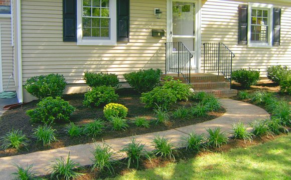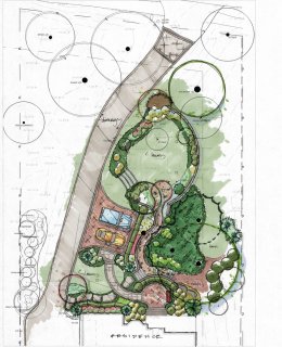
 This Alexandria, Virginia home had an awkward driveway configuration and needed a more inviting front yard landscape design. Landscape architect Chad Talton worked with the client to identify three points that would be addressed in the design plan:
- The long driveway had no turn around space. This minor every day nuisance became a major inconvenience when guests dropped by.
- The house, sited mid way up a side sloping lot, lacked a defined entry area. There was no “front yard” as such to frame the house.
- Views of the home were obscured on approach by random shrubbery and scrubby trees.
Re-grading and functional aesthetics
The solution to the first problem –the need for additional parking and a turnaround area- became the anchor for this front of home landscape design. The driveway couldn’t be widened because it was too close to the property line. So, the only logical location for a parking pad required filling and leveling the slope near a small grouping of cedar and black walnut trees.
Immediately up hill from that spot, the architect’s plan specified additional fill and leveling to create a more welcoming landing at the front of the house. These changes in grade are held together by retaining walls and steps.
A curved retaining wall follows a line along the new front walkway connecting the front entry to the parking pad. So, the landscape architect found an interesting way to resolve the functional problem (parking) while improving curb appeal of the house.
Un-designing the designed landscape
If there is anything I would say about Chad’s design sensibility -which I love- it’s that it can make a residential area look just too formal because it is so full and so complete. That’s his job of course, to think of every little thing. That’s why you hire him. When I raised this point, he immediately had ideas for how to relax the formality of the design. And we got to an end result that we love.” –Karen Nussle, Alexandria VA
The client and architect worked together to get the right feel for the front yard plantings. The client wanted her front garden to have a loosely arranged collection of flowers and plants—less studied in appearance than what was shown in the original plan. They accomplished this by installing smaller groupings of a wide variety of different plants.
They implemented a mix of colors and different seasonal blooms for the design. The client is particularly fond of “cut flowers” such as daisy and aster because she likes to bring fresh flowers into the house. They also chose species based on how they look when they aren’t flowering, for their contrasting leaf shapes and textures as well as variations in shape and height.
Based on the size and scale of the area, we use different tactics to create impact. Looking at the landscape design on a two to three acre property from 100 yards away, you create impact with massing, with groupings of 20 of the same type of shrub. In a smaller area, you use smaller groupings with more variety—so you aren’t overwhelmed by one plant type. –Chad Talton, Registered Landscape Architect
YOU MIGHT ALSO LIKE


